Showing posts with label 12x12. Show all posts

Monday, October 28, 2013

Printing on Die Cut Paper

Hello.

I was asked recently to create a card for our church's staff appreciation. The only direction I received from my Sunday School classmates was "make it big!"  So, I gave my imagination a little workout and decided to create a 12" x 12" card.  Not knowing precisely what it might look like, I made the trip over to Michael's to see what might strike my fancy.

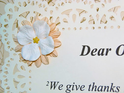
Within about five minutes of entering the store, I knew precisely what I wanted to do. I found a beautiful, decorative designer paper for the base of the card - and then chose a lovely die cut paper upon which to print a verse of scripture. I purchased a piece of 12" x 12" chipboard to mount the card on, and purchased a couple of sheets of plain cardstock for signatures on the back. When I got home, I dusted off a display easel that I've had for many years.

Here's what my completed card looks like:


Now, after telling a dear friend what I was doing, she suggested I talk about printing on the die cut paper. It looks very delicate - and in fact it is a bit.  It's cardstock weight, but still, the odd shape and cut-outs presented a challenge not to tear or jam in my printer.  So, I pulled out my Scrapbook Adhesives brand repositionable E-Z Dots and rolled the tape onto the back edges of the die cut.  I then mounted it on a solid sheet of 12" x 12" paper, and put it in the printer. The "carrier" sheet did precisely what I wanted; it provided a standard piece of paper to go through the printer rollers.  The die cut stayed affixed to the carrier sheet and the verse printed beautifully on the intricate paper. Then I simply unmounted the die cut sheet and re-mounted it on my background paper.  Easy!  No tears; no smudges; no problem.

Here's a little video on how to print the verse on the die cut paper:


So, that's my tip for today.  I hope you give this a try the next time you want to print on a piece of intricate die cut paper.

Thanks for stopping by.  I hope you'll come again soon.  May God bless!

Wednesday, July 10, 2013

Scrapbooking Life in Greenville

Scrapbooking became a major hobby for me many years ago, but in the last couple of years I took a break from it and started making cards. This weekend, the pendulum swung once again! My dear friend Lisa came to stay with us, and she helped me enter into the more modern age of building pages of memories.

Today's offering isn't earth-shattering, as its construction is quite simple, but it makes me very happy. My subject matter for today is my dear hubby, James.


Scrapbook pages don't have to be extraordinary or unusual. Those that capture everyday life "just because" can become some of the dearest ones of all.  Here I've depicted James engaged in some of his normal activities. He loves to read the morning comics and enjoy a good cup of decaf, shop the local farmer's market, play baritone in the local community band when he can, and he sometimes picks me up from work (along with our sweet little wiener dog).  Not all of these things happen every day, but they are all a part of his life and keep him occupied while I'm at work. Naturally, there's much more to learn about James that is quite extraordinary (Really!), but it will keep for another day.
 
This page works very well compositionally. What does that mean?  I have two pictures with my husband facing right, and two pictures with him facing left. By placing the photos so that my husband's face is always looking "into" the page, viewers are directed to do the same. If I had placed the photos on the opposite sides of the page, Jim would have been looking "out and away," and this would have been very distracting to anyone viewing the page.
 
Finally, my page construction is quite simple. It was constructed on plain white 12x12 card stock, and has four 4x6 photos, two vertical and two horizontal, that form a perfect square. Each photo is matted on a piece of colored card stock, and the page title takes center stage. I used an assortment of different letters (whatever was available), and the word "life" is prominent in red Thickers. I've handwritten captions around the edges of the photos and added a die-cut flower embellishment between each one.
 
Well...thanks for stopping by. It's an honor to have you here, and please do come again. Coming soon...my review of the new Copic Coloring Guide Level 4: Fine Details.