Tuesday, December 31, 2013

My All-Time Favorite Crochet Afghan Pattern

Hi, everybody.

As we wrap up another year, I wanted to share with you a favorite crochet pattern over the years. There's such a variety of patterns in the world that it seems almost inconceivable to me that I've used this one over and over. Nevertheless, I've made four afghans with Granny's Garden in a variety of colors. It just comes out so pretty that I can't quite help myself. I highly recommend it.  (NOTE: If you want to print the pattern, I also recommend that you print directly from the web page. If not, you may be asked to load several applications onto your computer. I make no statement as to the wisdom of that.)

So, what do I love about the Granny's Garden pattern?

First, I love the pattern, which you'll find in the link above, in case you haven't already clicked it. I had an original printed copy of the pattern, but now that I have a physical piece to go by, I don't really need the printed pattern any more. (I may find it again one day, but if I don't, that's okay.) 

Second, if you're the type of person who gets bored making granny square after granny square, this pattern offers a lot of variety in that you get to make two different (solid) color squares, and then you work in rounds for a time with a third color.  And just when you're finishing up a set of those long rounds around your squares, you get to make squares again!  Perfect!  :-)

Third, I love the way the squares and rows are joined.  I posted a video earlier about how I crochet squares together, with no sewing! Although I can't remember precisely, this is probably the pattern that taught me to do that.

Fourth, I love the potential for variation in this pattern. The fourth afghan I made used a multitude of colors instead of just three. I consider it my best afghan ever!  Here are a few pictures of the last and best of the four.  


To hear more about how I altered this pattern to make it my own, here's a short video.


I hope you've enjoyed this bit of crochet fun. I'll post another video soon on how to work front post double crochet (fpdc) and back post double crochet (bpdc), which makes a really interesting piece.  For paper crafting fans, I'll also be putting up some new card and scrapbook creations soon.

Thanks for stopping by.  Happy New Year 2014!

Thursday, December 26, 2013

Christmas - Season of Wonder

Merry Christmas!


I hope that your Christmas Day was filled with love and laughter this year.  As we spent time with family in the last few days, we experienced a sense of wonder as we watched the little children rip open their gifts and see what treasures they held.  Happiness comes so easily to them, it seems. Perhaps we should take a lesson from them as adults!

Today, of course, is Boxing Day. Apparently it originated as a day when employers would give "boxes" of gifts to tradesmen, servants, or people of "lesser status."  Isn't that interesting?

Hopefully, many of us participate in similar practices.  One well-known practice is participation in Operation Christmas Child, which Franklin Graham leads.  Our church is a collection center for those boxes, and it was a very fruitful year.

Others participate in taking tags from local trees placed for the purpose of providing gifts to children in low-income families.  And for those of us Charles Dickens fans, you may recognize another practice that was included in "A Christmas Carol," when two gentlemen approached Ebenezer Scrooge about providing for the poor and needy. That, unfortunately, didn't go so well...at least not at first!

How heartwarming it is to hear of people's benevolence at this time of year. God has provided each of us with something we can do to lift the spirits of others. Sometimes it may simply be to offer a kind word of encouragement - a "free" gift.  And I have always found that no matter what we do to be a blessing to others, we are often more blessed by the giving than are those who receive. Isn't it amazing how that works?

But back to Boxing Day.  Many families begin "boxing" away their Christmas decorations on December 26. But what is being boxed?  Is it just the physical decorations, or is it more?  Let us hope that our packing doesn't rob us of our feelings of benevolence, our wonder at the arrival of the baby Jesus, or of the hope that we find in the start of another year.

As we begin 2014, may we each do our part to make our world a better place. Thank you for stopping by to spend these few minutes with me. I cherish your presence here and wish for you a joyous new beginning at this most wondrous time of the year.  May God bless!


Saturday, December 21, 2013

Winter has arrived?

Hello everyone.

It's hard to believe that wintertime officially arrived today. Normally it's in the 20s to 40s this time of year, but today?  It was mid 70s!  Really.  I went out in just a light sweatshirt and thought I'd roast before I could get home and change it!

It may seem funny to comment on an unusually warm winter, but...that much warmth this time of year generally spells storms.  Tomorrow is expected to be no different. We're supposed to have thunderstorms and wind. Hold onto your lawn ornaments!

Well, now for a bit cheerier subject - my card for the day. This cutie is Candy Cane Anneke, the December stamp of the month by From the Heart stamps. Check out other gallery entries here.  (No one can say I'm not loyal, as I feature of lot of their digital images.) I have lots of other brands, but find these images incredibly fun to color with my Copic Sketch markers.


My Copic color choices include:
Hat and candy cane: R22, 24, 29, 39, 59, 89
Skin: E00, E11, BV00
Cheeks: R20
Eyes: B00
Hair: E50, E31, E44
Dress: B63, B66, B69
Boots: E42, E55, E35
Outline and white shading: W1

Here's a closer look:


This card features navy blue cardstock, white X-Press It blending card for the image, Spellbinders Nestabilities Lacey Ovales die cut, a royal blue oval taped behind the die cut for depth, and Liquid Pearls accents on Echo Park 6x6 "Winter Wishes" paper pad.

And on the inside, I have more Echo Park paper, along with my greeting from Hero Arts Stamp and Cut Season's Greetings set.


I had a wonderful time creating this little darling. In fact, I really couldn't help myself as I made several cards from this image with various color combinations and designs.


The first and third images directly above also feature embossed snowflakes in white opaque, as well as some gold and diamond colored Stickles in the center of the designer paper snowflakes. Hope you enjoy my fun cards.
 
Now, to all you and yours, may you have a safe, happy, healthy Christmas. May God bless us each and every one, as we celebrate once again the newborn King!

Saturday, November 30, 2013

Balloon Ride

Hello. Today's 6x6 card is the November digital stamp of the month by From the Heart Stamps. I am very grateful to Faith Skrdla for her monthly image - and the opportunity to get the next one free by simply doing what I love and posting a card with the image each month. What a deal!  Of course, I have also purchased a number of them. Still a deal.


At any rate, the November stamp of the month was a challenge because of the balloons. I found lots of good tutorials on YouTube by searching on "Copic translucent balloons" or "coloring translucent balloons."  Some will recommend starting with the back balloon and moving forward, and some will do the opposite.  If you try this technique, you may want to experiment on a scrap image before attempting your final piece. 

Here's a closer look at my coloring. I thought it came out rather well for a first try! You'll also see in this shot that I hand-stitched the card, a move I wouldn't necessarily recommend unless you're going for a more informal or rustic look. Nevertheless, I'm happy with my result.


The papers for this card are Bazzill textured French vanilla and My Mind's Eye Vanity Fair 6x6 paper pad. This is a combination I haven't tried before, and it produces a fairly feminine look.

I've also been trying to pay special attention to the inside of my cards. It adds just a little extra surprise when your recipient opens the card.


Well, that's it for today.  Time for more fun before our dear cousins head back to Michigan. Thanks for stopping by - and may God bless!

A Grateful Heart

Happy Thanksgiving weekend!

How wonderful it was on Thursday to celebrate another day of thanks to God for all the wonderful blessings he has bestowed on me and my family! We thank God every day, actually, but Thanksgiving is a time to especially remember all that God has provided. Our holiday was a happy day of love, laughter, and peace.

The day was especially nice as we spent it at home with my darling husband's first cousin and her husband. They traveled all the way from Michigan to visit and have a traditional, Southern Thanksgiving meal.  We feasted on turkey, giblet gravy, ham, cornbread dressing (a.k.a. stuffing), green beans, potato salad, cranberry conserve, apple pie, pumpkin pie, and other assorted sides. Whew! A blessing in every bite!

Yesterday, we traveled around eastern North Carolina seeing the sites. Although we live in the region, we still saw several new places and had a wonderful time.

While our Thanksgiving meal was magnificent, there was nothing new in the fact that too much of anything is finally enough!  Last night we had a different meal and some wonderful ice cream in a nearby town. Emily discovered the lemon flavor on their last trip to visit, and we couldn't wait to try it again, so this was a much-anticipated treat.

Cousin Emily and Buddy

Darling Husband (DH) Jim

As we move from the Thanksgiving season to Christmas, may we all be ever mindful of the many blessings we have been given from God - and then each do our part to bring joy to others, as well. 

Thanks for stopping by, and please stay tuned for a new card before the day is out!  Peace.


Friday, November 22, 2013

Get "Well"

My mother sent me an obituary from my hometown a few days ago. A "girl" I went to high school with passed away this week. It isn't the first time someone my age has died, and I suppose it's to be expected as I advance in years.

I hadn't seen my high school classmate in years - and didn't know she'd been sick. How sorry I am that life was so short for her - although who's to say?  Perhaps we assume that more years is better. Yet, sometimes we see (or hear of) people who do more living in 10 or 20 years than some of us will ever do in 90.  I hope she packed a lot of living into her 55 years.

As I read her final tribute, I began to ponder the "Get Well" cards I put in the mailbox just Monday morning. There were three of them. One was for cancer, one for a stroke, and the third was for a cousin hospitalized for days with severe bronchitis.  

It occurred to me today, though, that we probably should send out more of these than we do.  There are many more sicknesses than just those of the body, although there are plenty of those to go around. There are sicknesses of the mind, the spirit, the heart, the world, etc.  Do we send out enough cards to those who suffer from one of these? Why not?

It seems to me that the world has a serious lack of encouragement. Physical illnesses can generally be seen, but what about the others? That may be more difficult to detect.  What does it mean to us to "get well"?  Is the sentiment only for the body?  Would someone not physically ill understand if they received a get well card?

Today I'm featuring a get well card - in the traditional sense. This digital image is called "Drenched" and is sold by From the Heart Stamps. I truly enjoyed coloring this darling image with my Copic Sketch markers in primarily purple and gold colors. It isn't visible in this picture, but I used Glossy Accents to make the raindrops and water puddle shine.

 
The image is die cut using Spellbinders Nestabilities Labels Eight - and offset, with the left border trimmed. The purple Bazzill textured cardstock is punched with Fiskars' Sunburst border punch, which appears to be discontinued. The punch is used on the front of the card - and is repeated on the inside, using a staggered orientation to simulate the appearance of streaming water. I really enjoyed this effect!


As I look forward to the arrival of 2014, I making a resolution to "get well." While I have several chronic ailments, and it would be nice to be rid of them, my meaning will extend far beyond the physical. I'd like to attend to my spiritual health, the love(s) in my life, my attitude, and more. I'd like to focus on what's really important to me so that the world, whatever that may be next year, won't beat me to a pulp!

How about you?  What do you resolve to do, be, or have in 2014? What are your dearest desires?

Hope to see you back here soon. Thanks for stopping by!


Sunday, November 17, 2013

My "Big" Brother

Hello.

My card for today recently marked the birthday of my "big" brother. Dan is three years my senior and was always there for me growing up. I'll always remember how he scared the neighborhood bully away from me when he caught him twisting my arm behind my back. He "politely" informed him that if he ever bothered me again, he'd have to come through him first! Wow! What a day that was. I think it's the first time I realized that my brother actually loved me. For anyone who has one, you know that brothers don't just go around getting all mushy with their little sisters.  :-)  He didn't exactly declare his love that day either, (although he has many times since), but his actions spoke loudly enough.

Anyway, Dan and I don't get to see each other much any more. We live 250 miles apart, and he works six days a week through most of the year. I only get to go home about 3-4 times a year, and since Dan's a truck driver, the last thing he wants when he's off is to get in a vehicle and drive.  With only one day off a week, he would be driving more than visiting anyway.

Well, here's Dan's card for the year.  I tried to make it masculine, but I expect the best I can hope for is that this is sort of gender neutral. I tried to go a little rustic with background papers and the bulky twine for the bow. At any rate, I know he was glad to be remembered.


For this card, I used Flourishes' Pinwheels and Popsicles stamp set.  I cased this card from Tosha Leyendekker, in a card she called "planted pinwheels." Her card was uploaded to the Flourishes gallery on September 1, 2013. 
 
The pinwheels are colored with Copic Sketch markers. The excellent design of the stamps meant it only took a few minutes to color each pinwheel - with a great result!
 
I've already made numerous cards with this set, which is very versatile.  I repeated a shadow-ink pinwheel for the inside of the card. (See the faint image at bottom right.) The corners of the white cardstock are punched and embossed.
 
 
Well, that's it for today. The hour is late, and tomorrow starts another big week at work. It's also time to count down the days until my husband's first cousin and her husband are coming to us for Thanksgiving. We can't wait! We always have such fun!
 
Thanks for visiting, and please stop back soon for another card. I should also have a new video coming soon.  May God bless!
 

Sunday, November 10, 2013

Beginner: Single Crochet - Take One, Two, Three

Welcome.

My mom taught me to crochet when I was ten years old, and it's been a lifelong passion. So, I found it funny (in a strange sort of way) a few years ago when I discovered that I had been doing the simplest stitch "wrong" all these many years!

Now, I wasn't really doing anything so terrible, but what I was doing was making the final look of my crocheted pieces something they weren't intended to be. You may be doing this, too!

So, today I want to focus on the single crochet stitch. First, let me say that the final look of your piece is entirely your choice, so if you've been doing the same thing I did, it probably doesn't matter. Most of my crocheted items are afghans - where only the right side of the piece is going to show most of the time. Now, my husband has trouble with this. He says the "wrong" side, a.k.a. the back side, is prettier than the front. I'm always telling him to turn the afghan over on the bed. Fact is, if I had been doing the stitch the standard way all these years, it might not make any difference at all.

Here's what I mean. Let's compare three different treatments for the single crochet.

Take 1
This single crochet sampler uses the "correct" method. When I work on the next stitch, I put my hook through both loops of the single crochet stitch. This is the stitch most patterns are talking about when they call for a single crochet.


Take 2
This single crochet stitch features placement of the hook through the front loop of the stitch only. Now, this is what I've been doing for years in error. While the stitch works up just fine, every other row has a noticeable ridge line running through the work. The line is made from the back loop that wasn't used when working each row. 


Take 3
Now for my final method. This method uses the back loop of the single crochet only. When this is done, the finished piece appears to have hills and valleys in the rows.


This has a very different look and feel from either of the other two methods, and it will significantly change the gauge (height) of your work. For example, 12 crocheted rows using this method is about the same height as 10 rows in sample 1 (yellow) above.

Now that you've seen how the work looks using these three variations, here's a short video on how I achieved each look. You may watch on YouTube if you prefer.


If you're a beginning crocheter, I hope you find this video helpful. Perhaps it will start you on the right path to many lovely handmade pieces in the years ahead.

Thanks for joining me today, and please come back soon. May God's blessings be plentiful!

Monday, October 28, 2013

Printing on Die Cut Paper

Hello.

I was asked recently to create a card for our church's staff appreciation. The only direction I received from my Sunday School classmates was "make it big!"  So, I gave my imagination a little workout and decided to create a 12" x 12" card.  Not knowing precisely what it might look like, I made the trip over to Michael's to see what might strike my fancy.

Within about five minutes of entering the store, I knew precisely what I wanted to do. I found a beautiful, decorative designer paper for the base of the card - and then chose a lovely die cut paper upon which to print a verse of scripture. I purchased a piece of 12" x 12" chipboard to mount the card on, and purchased a couple of sheets of plain cardstock for signatures on the back. When I got home, I dusted off a display easel that I've had for many years.

Here's what my completed card looks like:


Now, after telling a dear friend what I was doing, she suggested I talk about printing on the die cut paper. It looks very delicate - and in fact it is a bit.  It's cardstock weight, but still, the odd shape and cut-outs presented a challenge not to tear or jam in my printer.  So, I pulled out my Scrapbook Adhesives brand repositionable E-Z Dots and rolled the tape onto the back edges of the die cut.  I then mounted it on a solid sheet of 12" x 12" paper, and put it in the printer. The "carrier" sheet did precisely what I wanted; it provided a standard piece of paper to go through the printer rollers.  The die cut stayed affixed to the carrier sheet and the verse printed beautifully on the intricate paper. Then I simply unmounted the die cut sheet and re-mounted it on my background paper.  Easy!  No tears; no smudges; no problem.

Here's a little video on how to print the verse on the die cut paper:


So, that's my tip for today.  I hope you give this a try the next time you want to print on a piece of intricate die cut paper.

Thanks for stopping by.  I hope you'll come again soon.  May God bless!

Saturday, October 26, 2013

Great New Creative Cardstock Class Available!

Hello.

Today I want to let you know about a fabulous new online class!  My dear friend, Lisa, has recently published a series of 10 scrapbooking lessons called Creative Cardstock.  If you're like me, you probably have a lot of plain cardstock in your stash, waiting for the muse to hit you so that you can use it up and move on to something more exciting! If so, Lisa's class can go a long way toward accomplishing that end.  In fact, her tips show how to make the plain and ordinary much more appealing.

Lisa offers a great deal in her class. As a former Fortune 500 trainer, she knows how to showcase her scrapbooking process, providing clear, thoughtful video instruction and examples. She makes it simple and enjoyable. Lisa also provides a "handout" for each lesson that you can print out for later reference. This course is an exceptional value for what you learn.

Now, because I told you that Lisa's my friend, you may want additional information from others. So drop on over to Lisa's YouTube channel, where more than 1460 people have subscribed to her videos.  You may also be interested in her blog.

In the interest of fairness, I disclose that Lisa asked me to help her test parts of her class before she made it available to the public. I can also tell you that I wouldn't endorse it if I didn't feel it was worth every penny. You can read the full course description here.

I used some of Lisa's ideas (and layout) to complete this two-page spread:


I have 20 pictures on this layout I titled "Girl Meets Ocean." (It was my niece's first encounter with the beach!)  Thankfully, I was able to crop my pictures to show the main ideas and fully capture this vacation trip. I've used a number of products and techniques for this layout: cropping, die-cutting, stamping, journaling, composition, color-matching, layering, misting, and more. I hope you like it!


Well, that's it for today. Please be sure to drop back in on Tuesday for a live video on how to print on die cut paper.  Thanks for stopping by - and happy scrappin'! 

Tuesday, October 1, 2013

A Message of Hope

What a wonderful privilege we had this evening as we traveled back to campus for an evening lecture by Dr. Jane Goodall, DBE (Dame of the British Empire). Dr. Goodall, known to most people as a researcher and writer about chimpanzees, has broadened her focus through the decades to become an activist for our planet.


I'm not quite sure what I expected to see or hear when I went to the lecture tonight. I knew of Dr. Goodall's legendary work with chimpanzees, but I was totally unprepared to see this petite little woman of nearly 80 enthrall a sold-out audience (with two additional simulcasts on campus) for nearly two hours. She quietly went about recounting her early childhood, beginning with a close encounter with earthworms at the tender age of 18 months!  She gave homage to her mother, who rather than scolding her for having earthworms in her bed as a toddler, helped her get the tiny creatures back outside to the earth that nurtured them.
 
Dr. Goodall gave us a great picture of the behavior of chimpanzees, including her favorites in the Gombe Stream area of Tanzania, but she also talked about her hope for our world. She's been traveling as an activist since 1986, spreading her message to anyone who'll listen. She talked a lot about connecting our heads (intellect) and our hearts. To help accomplish this, she established the Roots and Shoots global network to help young people get involved in making the world a better place.
 
I was impressed by her common sense approach to animal and environmental activism. When she took questions from the audience, she was careful to let us know that humans should respect chimpanzees and allow them to live in their own world. She never attempted to make them "her family," but observed them from a distance and learned their behaviors. She cautioned that humans should never buy baby chimps, attempting to turn them into pets. She reminded us all that they are, in fact, wild animals - and they will always be so. Chimpanzees are much like humans in that they are able to show compassion, but they are also able to show great anger and aggression.
 
How wonderful for Dr. Goodall that she has been able to travel around the world sharing her message of hope into her old age (although in many respects I think she's younger than I am). I hope she is able to continue this work for many years to come.  It was a privilege to be able to see her.
 
And so I close for the night, tired, but wondering what I might do tomorrow to go and improve the world. One person can do it, you know!
 
Thanks for stopping by - and I hope you come my way again. May God bless!

Monday, September 30, 2013

Birthday Flavors

Welcome!

It's been quite some time since my last post, and I feel just terrible that I've been absent so long. Summer is my busiest time of year at work, and I simply couldn't stop for any reason - not to mention that I felt like I didn't have a brain cell left by the time I got home!

Well, fall's arrived, and I'm already looking ahead with great anticipation toward the holiday season. It's always so much fun! Yes, I know it can be stressful, but honestly...we shouldn't let little irritations rob us of our joy.

Meanwhile, this is also "birthday season" in our family. The month of November alone has six birthdays and 2 anniversaries.  Whew!  That's a lot of cards!  And yes, I'm already busy getting them made. If I don't, I'll never make it.

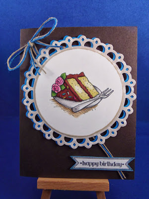
Okay, so enough rambling. This summer I bought a new stamp set from Flourishes called Popsicles and Pinwheels.  It's a birthday set, and I'm having great fun with it. My favorite stamp from the set is a slice of birthday cake. The fun part is that I can use my Copic markers to color the birthday "boy" or "girl" their favorite flavor of cake, which naturally doesn't measure up to the real thing. Then I can surprise them with an actual cake (or cupcake) in the same flavor, and they're really excited!

The second positive to this stamp is that birthday cake is gender-neutral. I can simply change the paper colors and embellishments and make the cards masculine or feminine. Here are some examples:


My husband's favorite - red velvet cake with cream cheese icing

Don't like red velvet?  How about a little yellow cake with chocolate frosting:

Thick twine and dark cardstock are perfect for a male birthday
 

Don't see your favorite yet? How about a slice of strawberry cake with whipped cream?


A feminine birthday card complete with crocheted embroidery floss bow

Chocolate cake with dark chocolate icing. What do you think? A man's card - or a woman's?
 
My, my, my. I suppose it's a good thing all this yummy sweetness is made of paper. I feel my waistline expanding just looking at it! I hope you've enjoyed the versatility of this wonderful stamp set from Flourishes.org
 
Thanks for stopping by - and I hope to see you again soon.

Sunday, July 28, 2013

Mixed Media - Copic Markers and Watercolor

Mixing media is all the rage these days, so my topic for today is mixing Copic Sketch markers and watercolor. I started with a lovely image from a practice exercise in the new Copic Coloring Guide: Level 4: Fine Details by Colleen Schaan and Marianne Walker. While I consider coloring the image a fairly advanced process, or at least labor intensive, the mixing of media itself is very simple.

There are a couple of things to know before you get into the video:
(1) I didn't focus on the coloring process today. I colored the main image in advance.
(2) I used X-Press It Blending Card as my paper stock. Blending Card is formulated for use with Copic markers, but doesn't necessarily handle watercolor very well. A nearly-dry aqua (water) pen is key to success.
(3) When mixing media with Copic markers, always do the Copic coloring first. Laying down color on top of another medium is not recommended and may not be successful.
 
Here's a photo I took in mid-process. Take a look at the differences between the left and right sides of the picture.  On the left side of the screen, the image has been stippled with three different colors of Copic markers.  (Stippling simply indicates random dots applied with the tip of my markers.) Then, I have scribbled a random line of watercolor pencil outside the male gnome's hat and body. Water has not yet been applied to the left side of the image.


Compare the left and right sides of the background image. A watercolor wash has been applied to the right side, providing a smooth, blended look.

On the right side of the screen, stippling has also been done. Watercolor pencil has been applied to the right of the female gnome's hat and body - and water has been applied with an aqua pen to provide a color wash. Notice the much smoother, blended look.

This process is very simple, but to get a better feel for it, here's a short video that shows how it's done:


Now that you've seen the process in action, take a look at my finished image (below). After shooting the video, and completely disregarding guideline #3 at the top of this post, I decided that I wanted more "pop" from the couple. To add dimension, I went back in with a Copic marker and outlined the outer edges of the image with a thin line of marker.  Note how much more dimensional they look with the final outline.

A final Copic marker outline was added to enhance dimension


Don't quite see it?  Squint your eyes and look again. You'll see a lovely, dimensional aspect that places the couple front and center in the image.

Well, that's it for today. I hope you enjoyed today's mixed media demo. Please join me again soon as we explore more artistic techniques. And may God bless!

Friday, July 26, 2013

Review: Copic Coloring Guide: Level 4: Fine Details

Have you ordered your Level 4 Copic Coloring Guide yet?  If you're serious about becoming a good Copic marker artist, and you don't consider yourself an expert already, then you really should buy this new edition! 


Here's why:

Earlier editions of the Copic Coloring Guide, while very good, were geared more toward the mechanics of using Copic markers for specific applications.  Level 1 focused almost entirely on learning the Copic numbering system, how to blend color, and other basic functions. Level 2 looked at coloring nature, and Level 3 was all about people.  All of them offered marvelous tips for improving an artist's coloring techniques. If you're new to Copic markers, they're a good place to start!

For the more advanced crafter, this 4th edition is taking us to a whole new level, with specific tips on how to reach "artist level" with our coloring. In fact, it goes beyond Copic coloring into how to use Multiliner pens and other mediums (Hmmm...should that be media?  Don't know.) to achieve more advanced results.

Here are some examples of what you'll find in this guide:

There's a huge emphasis on light and light sources. The authors, Colleen Schaan and Marianne Walker, begin with basic terminology you'll see throughout, and then provide tips on how to check images for contrast (the difference between light and dark values).  They offer step-by-step instructions on how to conduct a value study on an image - and provide illustrations of three different studies conducted on a single image, with the light source in a different place for each one. This provides a good visual of how the process works. They carry this idea throughout the book.

Once you have a good idea about how light works and affects your images, then you'll go on a visual journey that explains about shadows, undertones (and underpainting techniques), highlights, textures, surfaces, and more. Each page offers exercises for the artist to experiment with, and a bonus CD provides digital files of all the illustrations.

Once you have these basics in your head, you'll find another section of the book devoted to even more specialized topics.  Want to mix your own Copic colors?  The book will show you how. Want to enhance your stamped images with additional graphics, artistic shading or textures?  No problem. Ever wished you could place an image inside a scenic background on your card?  You can learn how here.

Well...I suppose I'm starting to sound like the book's personal salesperson.  Perhaps I am, but I really do like it that much.  If I can offer one bit of critical feedback, I would wish to know more about using the Copic airbrushing system.  There's a page or two devoted to airbrushing, but it doesn't really get into technique very much.

The final bit of good news is that the authors used a lot of familiar artists in the Copic world to create special projects for the book. You'll find projects from great Copic artists like Cindy Lawrence (whose card is on the front cover), Michele Boyer, Lori Craig, Melanie Holtz, Jennifer Dove (who made the card on the back cover), Jane Allen, Kathy Jones, Sharon Harnist, Debbie Olson, and of course, the authors themselves.

Each coloring project features a photo, step-by-step instructions, list of materials, and best of all, the maker and name of each stamped image. That's great, as I am particularly fond of a few of these stamps!

As you can see, I love the new Copic Coloring Guide, Level 4, Fine Details. In fairness, I should tell you that I was a blog hop winner for a free, autographed copy of this guide. One copy was given from each person writing for the hop, and I won the copy from Lori Craig at Split Coast Stampers. Thanks, Lori! Nevertheless, I can also say that I had the book on pre-order before winning a free copy, and my "win" did not affect my review of the book.

You can find this book at online shops like Annie's Attic (the publisher), Amazon, etc. For a quick find, look for ISBN 978-1-59635-575-0. Hope you enjoy it as much as I am!

Thanks for visiting.  Please stop by again soon! 

Wednesday, July 24, 2013

Brayering - Quick and Beautiful

Welcome.

Today I have something new for my technique toolbox: brayering. When my friend Lisa came to visit, she brought her brayer, along with some lovely ink pads - and access to a YouTube video tutorial on how to make this gorgeous card.


Now, I was completely new to this technique, and I found it quite fast for the effect it achieved. The first task was to punch a circle mask and adhere it to the card stock where we wanted our sun.

Next, we cleared the table top to avoid ink splattering on any other papers, and then rolled the brayer over the first ink pad. We started with the lightest color first (Crushed Curry) and rolled the entire surface of the card stock (white). Then we cleaned the brayer and applied a second ink color (Dusty Durango), rolling horizontally to leave some of the light color at the bottom; we took the darker color (Bravo Burgundy) all the way to the top in successive rolls.  A few horizontal striations just above the mountains give you a sense that all was not perfectly blended. Still, the effect is not distracting.

The next step was to tear some scrap paper to form the mountains. This was placed on the image above the area to be rolled, and the bottom area was brayered in a brown color (Close to Cocoa) to form a mountain. We then moved the torn paper and slanted it a different direction to form a mountain range - and brayered once again.  I was really excited at this point, as this technique was pretty close to idiot proof! 

Once the ink had dried to a large degree, the sun mask was removed and a bit of additional color was sponged on the sun to match it to the rest of the card. Then, the reeds were stamped using Stampin' Up's Inspired by Nature stamp set. We used simple black ink (Tuxedo Black Memento), although we might also have used Versamark and then black embossing powder.

Finally, a number of birds were drawn in with a black Sharpie pen. This was a fun finishing touch, as we were both able to decide for ourselves where our birds wanted to fly! The whole image was layered with a light-colored mat (More Mustard) card stock, and then taped to Bravo Burgundy.

It seems to me that it took longer to type this post than to make this card! So, never believe that beautiful has to mean complicated or lengthy. I'm very pleased with my result, and I will surely use this technique again.

Please also drop by my friend Lisa's blog to see her matching card. Lisa loves to scrapbook and has become a real YouTube sensation!

Thanks for stopping by today.  I hope you'll join me again.  Blessings to you and yours!

Monday, July 15, 2013

Postage Tips for Non-Standard Cards

Hi. One of my first posts for this blog was called Card Shape Matters - A Brief Postal Primer. In that post, I talked about card size and how the U.S. post office determines the postal rate. I also talked about the aspect ratio formula to figure out whether a card needs extra postage.

Today, I visited the post office and received additional information.  The card I mailed today is from yesterday's post. It is 6x6 in size and features a paper flower with an inflexible center. The postal rate was 86 cents; here's why.  First, the card weighed 1.1 ounces, which exceeded the 1 ounce limit for regular postage; that cost an extra 20 cents.


Second, the card was non-machinable for two reasons: (1) It didn't meet the aspect ratio of 1.3 to 2.5 (length divided by height); and (2) the inflexible element of the flower would have created an issue if it went through the postal machines.  Although there were two issues here, non-machinable was non-machinable, so there was a single extra charge of 20 more cents.  Total?  First class postage of 46 cents, plus 20 cents for over 1 ounce, plus 20 more cents for non-machinable. Total postage was 86 cents.

Now, don't get me wrong; I didn't mind the extra postage. The important thing here is that if I hadn't gone to the post office, my recipient may not have received my card at all - or might have received it postage due.  I most definitely would have been short by at least 20 cents. Either way, that would have been bad.

Today's experience simply reinforces the fact that it's best to know the regulations. It also says that if you're interested in only regular first-class postage for your cards, stick with standard size envelopes and flat, flexible cards that can go through the post office's automated sorters.

So, how do YOU spell "dimensional"?  Ha-ha! Give me layers or just forget it!

Thanks for stopping by, and join me again for more card making and scrapbooking creations. May God bless!

Saturday, July 13, 2013

A Colorful Day

From the Heart's July stamp and sketch of the week challenge are so much fun that I just sailed right through getting them done. Now, for anyone who knows me, you know that's extremely unusual! In fact, I've already completed two cards with this adorable digital stamp. My first card is for weekly sketch challenge 025. It's a 6" x 6" card.

FTH Sketch025 Challenge
For those who'd like to play along with the sketch challenge, here's the link. You can also find the painting ladybug digital stamp here. Projects for the stamp of the month challenge must be uploaded by the end of July.
 
Here's the second card project, which is a traditional sized 4 1/4" x 5 1/2" card. I've included a close-up of my coloring with Copic Sketch markers.
 
Ladybug is about to add red to her flowers

A "colorful" card for a colorful friend
For those interested in the mechanics of the coloring for this card, I used the following colors: R29, R39, C5, and C9 for the ladybug. For the flowers, Y0000, Y11, and Y13. The painted dots are V000, V01, and V05 (violet); B11 and B15 (aqua); and RV02 and RV04 (pink). The paint brush is E31, Y28, and W1. Grass and leaves are YG00, YG17, and YG25.  Finally, the sky is B21 and B24.
 
My base card stock for the challenge (6x6) card is Bazzill Sunbeam, and the smaller card is American Crafts Sunflower. Both use X-Press It blending card for the colored image. The die cut circle is picot edge circles from Spellbinders.
 
The "Life is Fun..." sentiment is Simple Thoughts - Laughter from Cloud9 Design. The "wishing you a colorful day" sentiment comes with the ladybug image from From the Heart stamps.
 
I hope you like this whimsical image and my use of it here. Thanks for stopping by, and please join me again.

Wednesday, July 10, 2013

Scrapbooking Life in Greenville

Scrapbooking became a major hobby for me many years ago, but in the last couple of years I took a break from it and started making cards. This weekend, the pendulum swung once again! My dear friend Lisa came to stay with us, and she helped me enter into the more modern age of building pages of memories.

Today's offering isn't earth-shattering, as its construction is quite simple, but it makes me very happy. My subject matter for today is my dear hubby, James.


Scrapbook pages don't have to be extraordinary or unusual. Those that capture everyday life "just because" can become some of the dearest ones of all.  Here I've depicted James engaged in some of his normal activities. He loves to read the morning comics and enjoy a good cup of decaf, shop the local farmer's market, play baritone in the local community band when he can, and he sometimes picks me up from work (along with our sweet little wiener dog).  Not all of these things happen every day, but they are all a part of his life and keep him occupied while I'm at work. Naturally, there's much more to learn about James that is quite extraordinary (Really!), but it will keep for another day.
 
This page works very well compositionally. What does that mean?  I have two pictures with my husband facing right, and two pictures with him facing left. By placing the photos so that my husband's face is always looking "into" the page, viewers are directed to do the same. If I had placed the photos on the opposite sides of the page, Jim would have been looking "out and away," and this would have been very distracting to anyone viewing the page.
 
Finally, my page construction is quite simple. It was constructed on plain white 12x12 card stock, and has four 4x6 photos, two vertical and two horizontal, that form a perfect square. Each photo is matted on a piece of colored card stock, and the page title takes center stage. I used an assortment of different letters (whatever was available), and the word "life" is prominent in red Thickers. I've handwritten captions around the edges of the photos and added a die-cut flower embellishment between each one.
 
Well...thanks for stopping by. It's an honor to have you here, and please do come again. Coming soon...my review of the new Copic Coloring Guide Level 4: Fine Details.

Monday, July 8, 2013

Crafting Pair

How fortunate I have been this past week to have my dearest friend with me to celebrate Independence Day - and crafting. We had three full days to complete both scrapbooking and card making projects. We might have done more, but we also went craft shopping and enjoyed my husband's 4th of July band concert in the park!


Lisa and I completed these scrapbooking and card making projects in just three days!


Lisa brought these beautiful red, white, and blue flowers from her garden at home

Tar River Community Band performed at the Farmville Town Commons in an evening concert on the 4th of July

Lisa and I have been great enablers over time. I got her into scrapbooking many years ago when I was a Creative Memories consultant.  Then, she became a Stampin' Up demonstrator and got me into card making.  Somewhere along the way, we switched!  This weekend reminded me, though, how much I love to put scrapbook pages together and capture slices of everyday life.  Over the next week or so, I'll be highlighting some of these projects in more detail.

For now, though, I'd like to talk about what makes these crafting events so special. First, I get to spend quality, one-on-one time with my best friend of many years. We talk and catch up on what's going on in our lives while we work. Sometimes we say nothing at all, and that's just as relaxing.

Second, we use each other's tools and supplies. Lisa brings new papers and inks, as well as stamps and tools I may not have. Then she checks out what I have that she hasn't used before. She also makes good use of my Big Shot and dies. Each of us stamps or cuts a supply for later use.

Next, we try out new techniques together. We either try something totally new for both of us, or one teaches the other how to do something specific. This week, I showed Lisa how to make an easy easel card, she showed me how to lay out some scrapbook pages, and we learned the brayer together. We both walked away with some new skills in our toolbox.

Meanwhile, my wonderful husband supported our fun by cooking for us and taking a few photographs here and there. God bless him!  We were able to leave our work in a dedicated crafting space, so no worries there either.

Crafting together this way is always a really enjoyable experience. We set aside time for it - and then follow through. It's a stress-free experience, and we both end up with lots of finished (or well underway) projects in a short amount of time. What could be better?

If you haven't tried crafting with someone dear to you, I highly recommend it. I'm already looking forward to the next time we get together.

Thanks for dropping by today, and I hope to see you again soon with some new scrapbook and card projects. May God bless and keep you!

Tuesday, July 2, 2013

A Rose Blooms in Summer

One of my favorite stamp sets is Fifth Avenue Floral from Stampin' Up. My favorite stamp from the set is a beautiful rose. It's taken me quite some time to figure out how to color it with Copic markers, but I'm getting better now, I think.

I thought it might be interesting to see the progression of how I colored the rose to make this colorful birthday card. I hope you enjoy seeing it come together.


Here is the uncolored stamped image:
 
 
The uncolored image provides very little dimension. If we've seen a rose, we know of course that it has a number of layers and delicate textures. In order to start providing some of that dimension, I began the coloring process by underpainting the image with a neutral gray color (Copic N2).


Already, it seems the rose has become multi-layered. The underpainting provides just enough contrast to start showing layers - and also serves to provide some guidance about where shadows will fall in the finished image. In this case, the light source is assumed to be coming from the front right of the image. All shadowing should be consistent with that light source.


Now the rose is a beautiful pink (R81 and R85). Areas that were previously underpainted in gray have now been accented in a dark pink color. Some blending of color has been done, but dark areas continue to be dark. The rose continues to have dimension, but it is once again unclear where the light source is. Additional work is needed to restore a sense of light.


The final bit of "coloring" is shown in the image above. Actually, this effect was achieved by using the colorless blender marker (0) to move color around on the rose petals. Some people erroneously believe that the colorless blender marker removes color from an image; this is not true. The colorless blender simply moves color away from the marker tip to surrounding bits of the image. It is then important to do further blending to avoid dark lines where the ink has moved.


Finally, one last technique was used to bring dimension to the rose. The final image is actually two roses that were colored identically and then cut apart. The center and outer edges of the rose were cut from image 1, and then the middle section of the rose is from image 2. The pieces were then re-assembled using foam dimensionals to pop each piece up from the surface of the card.
 
The card uses Bazzill cardstock, Spellbinders ticket die-cut in two sizes, Mister Huey honeydew misting spray, and Heidi Swapp's 6x6 lattice spray stencil. Finally, the birthday greeting is from SU!'s Itty Bitty Banners. 
 
I hope you enjoyed this brief explanation of how this lovely rose bloomed this summer. Thanks for stopping by, and stay tuned for some scrapbooking fun!