Sunday, June 30, 2013

A Sea Turtle for Summer

Isn't nature amazing?!?  Today I'm sharing a new image I picked up from...you know where...From the Heart Stamps. I know, I know, I'm like a broken record! I do own lots of other stamps, I promise, and one of these days soon I'm going to post a number of cards from them. For today, though, I have this new digital stamp of a sea turtle.  I had such great fun with this one.


Now before you start thinking that my coloring is all wrong, or really weird, take a look at my inspiration photo for this one. I simply did a quick Google search on "sea turtle image," and this is what I found. Isn't it a beauty?!  My thanks to GulfMex.org for posting it.

Image found at http://www.gulfmex.org/wp-content/uploads/2012/05/SEA-TU1.jpg on June 25, 2013

We have such a wonderful, colorful world, and reality is almost always more interesting than fiction! Sometimes when I'm coloring an image I like to see what a creature, or flower, or something else, actually looks like.  So, I run a quick search on the Web and find tons of choices. I usually print out my favorite and then attempt to copy it from real life.

Of course, my choices are always limited by my Copic marker inventory. For this image, the turtle shell is E07 and YR07 (brights), E19 (accent), and E40 (base). The head, neck and fins are E50 (base), Y32, YR21, and YR15.

This image also has a sandbucket and shovel (YR02, YR07, Y18, Y35, B24, and B26). The ocean water and accent color in the fan shell are BG000 and BG10. The starfish has various earth tones from the E colors of Copic Sketch markers.

Finally, I employed a few different colors for the sand.  My base is E42 (sand white), with spots of E40 and E51.  I finished it off with the Atyou Spica Glitter Pen in clear color. It made the sand look like little specks of shiny gold! I hope you can see a bit of shine in the sandbucket and in the sand between the bucket and the mama turtle.


Enjoy! And stay tuned for more cards and scrapbooking treasures over the next few weeks. We're gonna get scrappy around my house! Thanks for stopping by.

Thursday, June 27, 2013

There are Always Flowers

This Friday marks a turning point in my life: my boss is retiring. Now, I don't know that she would want her name or photo posted on a blog, so I'm not including them.  She has a really unique name, so it wouldn't be fair. Still, I want to pay a short tribute to her, even though she'll probably never see it. It doesn't matter; she doesn't seek praise. She does what she does to be true to herself.

Some people might be glad to see a boss retire, but not me - not this one. I dearly love my boss. She's been my mentor, my inspiration, my source of knowledge, and in many ways my friend for the 2 1/2 years I've had my job. I know that a new leader is coming in, and I have the greatest respect for what she'll bring. I'm not worried about leadership; I'm simply sad to say farewell to my dear friend.

You may wonder what makes her so memorable for me. So, this is what I can say. "L" is always even-tempered; I have rarely seen her flustered. She always has a kind word to say, and for her the glass is always half-full. Most of the time, it's all-full. She meets frustration on my part with a simple phrase, "Calm down." Then when my spirit is quiet, we tackle challenges together. (I find this somewhat funny, as I always thought I was calm!)

"L" has been preparing me for her retirement for the length of my service in my job. She was fulfilling her own commitment before retiring and has stayed on long after most would have departed.  She has maintained her integrity and done her work faithfully for a long time. She is beloved by many - and sought out for her counsel constantly. Her shoes will be hard to fill.

Because of who "L" is, I made a special easel card for her staff to sign. It carries a quote from Henri Matisse: "There are always flowers for those who want to see them."  She liked that sentiment! And the flowers I get to see today are that we have promised to see each other and have lunch from time to time. While I'll miss her day-to-day, it isn't goodbye forever!  Praise God!


The flowers are dogwoods from Hero Arts. This is a single stamped image. The card is an easel card made from several different card stocks, including Bazzill and Neenah Classic Crest. The dogwoods are colored with Copic markers in pink and green. Coloring was super simple, as the shading for the flowers and leaves is already stamped from the image; there's no guesswork about where to shade.
 
The design for the easel part of the card came from a Split Coast Stampers tutorial by Beate Johns. I made my card a standard 5.5 inches wide, rather than the 4 1/4" she used. All other measurements were the same. This easel was super simple!
 
Thanks for reading my tribute to "L" and please join me again for a really fun card!


Friday, June 21, 2013

On Becoming a "New" Scrapbooker

Hello, friends.

I've been a scrapbooker for more than a dozen years, but recently I was given a simple tip that literally re-energized my scrapbooking. For years, I've used post-style albums, and one of the things I've always found frustrating is the need to de-construct my whole album if I leave something out of its proper spot in the book, or get something out of order. Well, no more.

My dear friend, Lisa, who is a marvelous scrapbook designer/creator, fellow blogger, and YouTube sensation, mentioned that she had made the switch some time ago to ring-binder scrapbook albums. One of the major reasons was to avoid the whole "de-construction" thing. Instead of spending time organizing, positioning, and doing all the pre-planning that post-bound albums demand, she could simply do her pages one at a time and place them in the album where she wanted them. Now, I'm sure something in me must have realized this all along, but her few words had bells going off in my head!  Of course - what a perfect solution!

So, now I've made the switch to ring-binder albums. No more "posts" for me!  I've settled on We R Memory Keepers albums for my collection (although there are many choices one might make). I've purchased an album, as well as photo sleeves in various configurations. The link given above is the least expensive price I've seen, particularly if you prefer to shop online, and there are several shipping options.  Or, if you like to shop the big box stores, such as Michael's, A.C. Moore, etc., there are often coupons for 40-50% off one regular priced item.  (For the record, I make no money from promoting these products.)

Keep in mind that photo sleeves are only one option for making scrapbook pages. I'll also combine this technique with true 12" x 12" scrapbook pages, designed and constructed, as my time allows. These can be inserted into the full-page photo sleeves easily and will give my albums a lot of variety. They'll also feed my desire for creativity.

I'm having a marvelous time just making my pages - rather than pre-planning exactly where they'll fall in my albums.  This is incredibly liberating - and no small feat for someone with decades of photos to put into albums.

For today, I prepared a recent layout from the last week of May. This was an especially memorable trip to me for two reasons: (1) we spent time and fell in love with my husband's first cousin and her husband from Michigan; and (2) I made my first-ever trip to North Carolina's Outer Banks. I can hardly believe that it took me, a native North Carolinian, more than 50 years to get there! It was beautiful and definitely worth the trip.

Today I want to share my Outer Banks page and talk about a few changes I'm adjusting to as a "new" scrapbooker. Let me name a few of the most obvious things:
  • Today we have tons more products, tools, and choices. Time-saving is a big deal, so album styles have exploded. I've made the switch from post-bound to ring-bound.
  • Moving to a ring-bound album means that the photo sleeve options will sometimes constrain my design choices. I'm okay with that if it saves me a lot of time. I can still make a fully-constructed 12" x 12" traditional layout if I choose.
  • Photo sleeves may limit the types of embellishments I can use for my pages. Again, if I want something particular, I can revert to 12" x 12" construction.
  • I've begun to use the computer to complete my journaling.  I have lots of album pages with my handwriting, and I may continue to handwrite some of them, but the time savings is immense.
  • Using the computer for journaling means that different types of embellishments may be needed; for example, the journaling box at top right (below) has a stamped-off image to add interest to the page. I have to plan embellishments more carefully, as journaling on the computer and leaving just the right space for stickers, brads, buttons, ribbons, or other items may be tricky.


For example, once I had the journaling box printed for this layout, I realized it was just too plain. I dressed it up with a stamped-off image from SU!'s Summer by the Sea (retired) rubber stamp set. My ink of choice is Hero Arts Shadow Ink in mid-tone Wet Cement. This required a bit of experimentation as a full-strength stamped image was just a bit busy. Stamping off once before applying to my journal block did the trick.

Full-strength stamp in Hero Arts Shadow Ink
 

Stamped-Off Image
The difference between the full-strength and the stamped-off image is fairly subtle, but it made all the difference on the journaling block. It added a nice finishing touch to the page. These types of challenges seem fairly minor, but they can mean a big adjustment for an "old-timer." It's worth the effort though.
 
That's it for today. Please join me again for scrapbooking and card making fun. Thanks for visiting and may God bless!

Tuesday, June 18, 2013

An Anniversary Card for June

Hello, friends. I'm so glad you've stopped by today.

June has been a very busy month. My husband and I hosted his first cousin and her husband for several days at the end of May and into June. What a happy, blessed time it was! They've only been gone for a very short while, and we miss them already. Here's hoping they trade the cold wintry North (Michigan) for the warm Southern hospitality here in Carolina. That was the purpose for their trip, really, so we're encouraging them to take the leap of faith!

Meanwhile, June is traditionally the month for weddings and all things "love"ly. We have dear friends who are celebrating their 12th wedding anniversary this month, and today's card is for them. I cased this card from yellowrose46 in Split Coast Stampers' challenge 183.


I've also taken a note from Cindy Lawrence, a regional Copic instructor and the person who taught my certification class, by adding some additional images on the inside of my card.

 
I kept the inside images soft by stamping off once before applying them to the card. The main image is from Stampin' Up's Summer by the Sea rubber stamp set; it's retired. I recently purchased this set on ebay, so I'm still working with various media to get a perfectly colored image. Rather than color this one, I simply stamped it with Ranger Distress Ink in pumice stone color. 
 
I chose Bazzill card stock in French Vanilla color for the base and Herbal Garden Dark for trim. The designer series paper is from the 6x6 My Mind's Eye Indie Chic "Citron" collection. The bluish-green paper at right was a little plain, so I used my new Simon Says Stamp Flower Friend Clear Stamp Set and one that I can no longer identify (sorry!) to stamp in Perfect Medium and finish off with Perfect Pearls Green Patina powder. The shine is minimal, so it's almost impossible to see in the photo.
 
Embellishments include a palm tree charm from K&Company Sea Glass metal art, and pebble brads from Making Memories Flowers Lemonade. I realized too late that the brads are such a perfect match for the background colors at left that they fade almost entirely into the background.
 
I popped up the main image on the front of the card with some Stampin' Dimensionals and finally added a sentiment on the inside from Fiskars Lasting Love Quotes.  Despite a few missteps, I'm really very pleased with my results.
 
Thanks for stopping by and may God bless!

Sunday, June 16, 2013

Happy Father's Day

I am truly blessed to still have my father with me this year. He's had some tough times with health in the last few years, but he's 84 and always finds a way to laugh and appreciate a bit of humor. That's why I'm hoping he'll enjoy this cute digi from From the Heart Stamps. It's called Necktie Banner and this is my first card with it.


Now, I don't remember that Dad had any particularly ugly ties when I was growing up - and these are pretty tacky. In fact, I remember Dad having very good taste when it came to ties.  Some of those trendy polyester suits, though...well, let's just say I'm glad that fashion has departed from our culture. One of these card ties might have fit in very nicely at that point. :-/
 
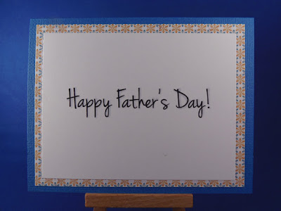
Anyway, I completed the look on the inside of the card with a simple wish:


Here's how I made the card:
I used American Crafts wave-colored card stock, added designer paper from Lily Bee Design Buttercup 6x6 Tiny Tablet, and colored with Copic markers. Colors include B24, B26, Y13, Y18, YR02, YR07, G21, G24, R21, R24, and C1. I used Ranger Distress Ink in Broken China for the edges of the image, and finally popped up the design with Stampin' Dimensionals.  And that was it!  I hope you like it.
 
Meanwhile, for all you fathers out there, young and old, may your children honor you this day (and every other) for all that you do for them. May you all be good dads and give your children the best future you can. God bless you for all you do!
 
Thanks for stopping by today and please come again soon.
 

Saturday, June 1, 2013

Clean and Simple Color Blocks

As much as I love to fuss over my cards, sometimes it's the clean and simple designs that speak to me most. This crisp color block card was so simple that it seemed almost impossible that it came out so well.  It's a little like life, isn't it?  Sometimes, we just need to chill out and go for the obvious.


The image for this card is from the Serene Silhouettes set from Stampin' Up! I used a plain piece of white card stock for the color block base. I cut three strips of complementary blues and greens, taped them to the base and trimmed them out. Then I stamped the image with Versamark ink, embossed in white, added three star-shaped brads, and taped it all to another white piece of card stock with the sentiment. Finally, I taped the constructed piece to American Crafts wave colored paper. Simple!

I may have to re-think my aversion to clean and simple styles. I've had trouble in the past with making them pretty enough to suit me. Maybe I'm getting the hang of it!

This card is posted to the Split Coast Stampers' Color Blocking with Cardstock challenge. The tutorial by Beate Johns was really lovely. Check it out!

Thanks for visiting, and I'll see you again soon.