Showing posts with label From the Heart Stamps. Show all posts

Monday, January 1, 2018

Artistic Year Ahead

Hello, dear friends! Happy New Year 2018!

Three years on, and I'm back online. I can't believe time has passed so quickly! It's January 1, and I'm already fulfilling New Year's resolutions: get back online, post on my blog, build my Etsy shop, and start thinking about what's ahead once I retire from my day job.

A lot has happened since I've been away. There have been health challenges, passing of friends, birth of new family members, family weddings, and all sorts of other normal life happenings. I'm sure you've had them, too.

While I started my blog to share craft projects and artistic endeavors, I expect to branch out a bit in 2018. I'll still be sharing some photos (and possibly videos) of what's on the craft table, but I also want to share more of what's happening in life.

I hope you'll join me as I continue life's journey. For now, it's back to work tomorrow after 11 lovely days of leisure. Oh my! Where DID I put that pesky alarm clock!?1? And my winter coat! Highs in the 30s this week in North Carolina. Brrrrr! On the bright side, the days are getting longer. 😊😊

The card sets below are now active in Etsy at www.etsy.com/shop/NCKarenArt. I'd be so pleased if you'd help spread the word! Additional card sets and other items are complete and will be posted in the coming days and weeks.


Happy New Year! May God bless you and those you love richly in the coming year! 


Thursday, January 30, 2014

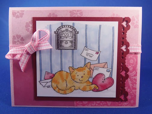
Caught Your Heart - FTHS January Stamp of the Month

Hello.

Today I'm featuring the January stamp of the month by From the Heart Stamps. It seems particularly appropriate as we are busily making our annual Valentine creations.

This cute little kitty is doing what many kitties do: holding a heart. So, 'fess up now.  Is there a kitty holding your heart? 

I will forever remember the time when I was small, and my grandmother always had a cat about. I can remember two that captured me especially. One was a big old tomcat named...you guessed it, Tom! Tom weighed 18 pounds and loved to curl up in my lap, purr, and fall asleep while he got a good rub. 

Then there was "Kitty Baby." Ha! Guess we weren't very original, huh? Kitty Baby was a Persian-Angora mix. She was a deep dusty shade of bluish-gray and had really long fur. I loved her dearly and she was a great addition to our extended family. Then, disaster struck. I was tested for allergies, and being found positive for cats, my grandmother decided it wouldn't do to have Kitty Baby in the house when I visited on weekends.  I was devastated when she gave our little blue angel to my cousin in the next state! Oh my, it was a terrible time. After many years of owning dogs as an adult, I can only imagine how hard that must have been for her. Still, I knew it was only her great love for me that made her do it.

Well, back to my card. This little cutie is colored with Copic Sketch markers. It also features a Fiskar's heart border punch in red, along with a couple of pink papers and plaid pink and white ribbon.


Here's a close-up shot of some of the coloring. I had a lot of fun with stripes in this image.


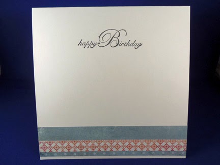
I repeated the heart border in one of the same papers on the inside of the card to add interest. This card will go to someone in the family who's a cat lover.  Hmmm...now who will it be? So many choices!


Some of you may realize this card used sketch challenge #50 at From the Heart Stamps. As usual, I missed the challenge deadline, which typically comes around much faster than I have time or energy to meet. Oh well, it's still a nice sketch. In fact, I'll be flipping it to feature another cute Valentine card in my next post. After that, I have a new scrapbook page lined up to share.

Thanks for joining me. There are lots of exciting new projects coming up, including a new crocheted lap afghan with an interesting stitch. For those digging out from Winter Storm Leon, or experiencing these extreme, low temperatures in the single digits, I pray you're safe and warm. Peace.

Saturday, December 21, 2013

Winter has arrived?

Hello everyone.

It's hard to believe that wintertime officially arrived today. Normally it's in the 20s to 40s this time of year, but today?  It was mid 70s!  Really.  I went out in just a light sweatshirt and thought I'd roast before I could get home and change it!

It may seem funny to comment on an unusually warm winter, but...that much warmth this time of year generally spells storms.  Tomorrow is expected to be no different. We're supposed to have thunderstorms and wind. Hold onto your lawn ornaments!

Well, now for a bit cheerier subject - my card for the day. This cutie is Candy Cane Anneke, the December stamp of the month by From the Heart stamps. Check out other gallery entries here.  (No one can say I'm not loyal, as I feature of lot of their digital images.) I have lots of other brands, but find these images incredibly fun to color with my Copic Sketch markers.


My Copic color choices include:
Hat and candy cane: R22, 24, 29, 39, 59, 89
Skin: E00, E11, BV00
Cheeks: R20
Eyes: B00
Hair: E50, E31, E44
Dress: B63, B66, B69
Boots: E42, E55, E35
Outline and white shading: W1

Here's a closer look:


This card features navy blue cardstock, white X-Press It blending card for the image, Spellbinders Nestabilities Lacey Ovales die cut, a royal blue oval taped behind the die cut for depth, and Liquid Pearls accents on Echo Park 6x6 "Winter Wishes" paper pad.

And on the inside, I have more Echo Park paper, along with my greeting from Hero Arts Stamp and Cut Season's Greetings set.


I had a wonderful time creating this little darling. In fact, I really couldn't help myself as I made several cards from this image with various color combinations and designs.


The first and third images directly above also feature embossed snowflakes in white opaque, as well as some gold and diamond colored Stickles in the center of the designer paper snowflakes. Hope you enjoy my fun cards.
 
Now, to all you and yours, may you have a safe, happy, healthy Christmas. May God bless us each and every one, as we celebrate once again the newborn King!

Saturday, November 30, 2013

Balloon Ride

Hello. Today's 6x6 card is the November digital stamp of the month by From the Heart Stamps. I am very grateful to Faith Skrdla for her monthly image - and the opportunity to get the next one free by simply doing what I love and posting a card with the image each month. What a deal!  Of course, I have also purchased a number of them. Still a deal.


At any rate, the November stamp of the month was a challenge because of the balloons. I found lots of good tutorials on YouTube by searching on "Copic translucent balloons" or "coloring translucent balloons."  Some will recommend starting with the back balloon and moving forward, and some will do the opposite.  If you try this technique, you may want to experiment on a scrap image before attempting your final piece. 

Here's a closer look at my coloring. I thought it came out rather well for a first try! You'll also see in this shot that I hand-stitched the card, a move I wouldn't necessarily recommend unless you're going for a more informal or rustic look. Nevertheless, I'm happy with my result.


The papers for this card are Bazzill textured French vanilla and My Mind's Eye Vanity Fair 6x6 paper pad. This is a combination I haven't tried before, and it produces a fairly feminine look.

I've also been trying to pay special attention to the inside of my cards. It adds just a little extra surprise when your recipient opens the card.


Well, that's it for today.  Time for more fun before our dear cousins head back to Michigan. Thanks for stopping by - and may God bless!

Saturday, July 13, 2013

A Colorful Day

From the Heart's July stamp and sketch of the week challenge are so much fun that I just sailed right through getting them done. Now, for anyone who knows me, you know that's extremely unusual! In fact, I've already completed two cards with this adorable digital stamp. My first card is for weekly sketch challenge 025. It's a 6" x 6" card.

FTH Sketch025 Challenge
For those who'd like to play along with the sketch challenge, here's the link. You can also find the painting ladybug digital stamp here. Projects for the stamp of the month challenge must be uploaded by the end of July.
 
Here's the second card project, which is a traditional sized 4 1/4" x 5 1/2" card. I've included a close-up of my coloring with Copic Sketch markers.
 
Ladybug is about to add red to her flowers

A "colorful" card for a colorful friend
For those interested in the mechanics of the coloring for this card, I used the following colors: R29, R39, C5, and C9 for the ladybug. For the flowers, Y0000, Y11, and Y13. The painted dots are V000, V01, and V05 (violet); B11 and B15 (aqua); and RV02 and RV04 (pink). The paint brush is E31, Y28, and W1. Grass and leaves are YG00, YG17, and YG25.  Finally, the sky is B21 and B24.
 
My base card stock for the challenge (6x6) card is Bazzill Sunbeam, and the smaller card is American Crafts Sunflower. Both use X-Press It blending card for the colored image. The die cut circle is picot edge circles from Spellbinders.
 
The "Life is Fun..." sentiment is Simple Thoughts - Laughter from Cloud9 Design. The "wishing you a colorful day" sentiment comes with the ladybug image from From the Heart stamps.
 
I hope you like this whimsical image and my use of it here. Thanks for stopping by, and please join me again.

Sunday, June 30, 2013

A Sea Turtle for Summer

Isn't nature amazing?!?  Today I'm sharing a new image I picked up from...you know where...From the Heart Stamps. I know, I know, I'm like a broken record! I do own lots of other stamps, I promise, and one of these days soon I'm going to post a number of cards from them. For today, though, I have this new digital stamp of a sea turtle.  I had such great fun with this one.


Now before you start thinking that my coloring is all wrong, or really weird, take a look at my inspiration photo for this one. I simply did a quick Google search on "sea turtle image," and this is what I found. Isn't it a beauty?!  My thanks to GulfMex.org for posting it.

Image found at http://www.gulfmex.org/wp-content/uploads/2012/05/SEA-TU1.jpg on June 25, 2013

We have such a wonderful, colorful world, and reality is almost always more interesting than fiction! Sometimes when I'm coloring an image I like to see what a creature, or flower, or something else, actually looks like.  So, I run a quick search on the Web and find tons of choices. I usually print out my favorite and then attempt to copy it from real life.

Of course, my choices are always limited by my Copic marker inventory. For this image, the turtle shell is E07 and YR07 (brights), E19 (accent), and E40 (base). The head, neck and fins are E50 (base), Y32, YR21, and YR15.

This image also has a sandbucket and shovel (YR02, YR07, Y18, Y35, B24, and B26). The ocean water and accent color in the fan shell are BG000 and BG10. The starfish has various earth tones from the E colors of Copic Sketch markers.

Finally, I employed a few different colors for the sand.  My base is E42 (sand white), with spots of E40 and E51.  I finished it off with the Atyou Spica Glitter Pen in clear color. It made the sand look like little specks of shiny gold! I hope you can see a bit of shine in the sandbucket and in the sand between the bucket and the mama turtle.


Enjoy! And stay tuned for more cards and scrapbooking treasures over the next few weeks. We're gonna get scrappy around my house! Thanks for stopping by.

Sunday, June 16, 2013

Happy Father's Day

I am truly blessed to still have my father with me this year. He's had some tough times with health in the last few years, but he's 84 and always finds a way to laugh and appreciate a bit of humor. That's why I'm hoping he'll enjoy this cute digi from From the Heart Stamps. It's called Necktie Banner and this is my first card with it.


Now, I don't remember that Dad had any particularly ugly ties when I was growing up - and these are pretty tacky. In fact, I remember Dad having very good taste when it came to ties.  Some of those trendy polyester suits, though...well, let's just say I'm glad that fashion has departed from our culture. One of these card ties might have fit in very nicely at that point. :-/
 
Anyway, I completed the look on the inside of the card with a simple wish:


Here's how I made the card:
I used American Crafts wave-colored card stock, added designer paper from Lily Bee Design Buttercup 6x6 Tiny Tablet, and colored with Copic markers. Colors include B24, B26, Y13, Y18, YR02, YR07, G21, G24, R21, R24, and C1. I used Ranger Distress Ink in Broken China for the edges of the image, and finally popped up the design with Stampin' Dimensionals.  And that was it!  I hope you like it.
 
Meanwhile, for all you fathers out there, young and old, may your children honor you this day (and every other) for all that you do for them. May you all be good dads and give your children the best future you can. God bless you for all you do!
 
Thanks for stopping by today and please come again soon.
 

Tuesday, May 21, 2013

Triple Treat Border Punch

Hi. It's been very rainy here lately, which is really great for growing things of all sorts, but it does tend to dampen the spirit a bit.  Still, instead of letting the blah weather get me down, I decided to turn it to practical use!

Today I turned my Fiskars Sunburst border punch into a triple treat by using it three times to achieve a new look for a card. This whimsical image, titled "Drenched" is once again by From the Heart Stamps. I can't seem to get away from these adorable digitals!


I printed my image on Neenah Classic Crest solar white cardstock and colored it with Copic Sketch markers in primarily purple and yellow shades. I die cut it using Spellbinders Nestabilities Labels Eight. And although it's difficult to tell from this photo, I used Glossy Accents on the raindrops and water puddle for some shine.

On the inside, I repeated the Fiskars sunburst borders twice. I tried lining up the punches exactly, but decided the result was too formal for this image. This offset punch pattern reminded me a bit of a running stream of water between the yellow and white papers.


And that's it! I hope you like the look of my triple treat punch. Thanks for visiting, and please join me again soon. 

Friday, May 17, 2013

Using a Digital Stamp for Copic Coloring - Inks and Papers

Hi. Welcome to today's post.

Today I'm wrapping up the project that I previewed last Friday: Humble Anneke. This sweet little girl just melted my heart when I first saw her. Anneke is a digital stamp by From the Heart Stamps.

For those who haven't tried a digital stamp, it's important to remember that the type of printer ink makes a difference in how your colored image turns out. Apparently laser printers are best when printing digital stamps for use with Copic markers - but I have an inkjet. I've successfully printed digital images and avoided any bleed-out of the image, but I've also had a few that weren't so successful. I've been told that either heat-setting the image, or letting it dry for a day or two, may help with this issue. Either way, I recommend giving it a try when you have time to test your papers and inks. (I have printed my images thus far on Neenah Classic Crest solar white card stock. The preferred "Blending Card by X-Press It" used by many Copic artists may work better. I haven't yet tried it for digital images, but can attest to its wondrous results for coloring!) 

I started the coloring process on Anneke with her hair. As you can see, her hair is long and wavy. Wavy hair is a bit more complex than straight hair – and requires a different technique. Each strand of hair should be colored separately. Strands that appear to be part of an outer layer will catch light and should be highlighted. Likewise, hair that curves outward will catch light. Artists typically use Copic marker numbers ending in 0-3 for highlights.  For this image, my highlight (base, or undertone) color is E31. The midtone is E35, and the darkest color is E37. This is a natural blending family.

After laying down a base of E31, I used a flicking method (from the crown down and from the tips up) to establish the dark colors with E37. Finally, I did minimal blending with the E35 midtone.


For Anneke’s skin, I chose E000, E21, E04, and BV000.  Yes, that’s right, there’s a blue-violet in there!  Why?  Because blue and violet are complementary colors to yellow and orange, the tone of most people's skin. The blue-violet helps to calm down the stark contrast in the shading.


Now, you may be thinking at this point that her skin still has some really serious contrast happening. That's true, and this is one of the scariest things about coloring with Copic markers until you get used to the idea of it. Most beginning artists over-blend and really tone down a lot of contrast. (And by the way, I definitely consider myself a beginning artist.) The hope, though, is that the greater contrast will add depth and beauty to the image.

The final steps were to finish Anneke's clothing and accessories. I chose two complementary colors: blue-violet and yellow. At long last, she became the focal point of this lovely card. I used Bazzill card stock, Spellbinders Nestabilities picot edge circles for the white background, Simon Says Stamps "You" set for the sentiment, and Mark Richards Crystal Stickers colored with Copic BV13 for embellishment. I hope you like my final result.


Thanks for visiting, and please stop by again for a brand new topic.  Happy Friday!